
A beautiful reference photo from Instagram or a celebrity ring shot often triggers the desire for a custom piece. The problem is that a 2D image hides nearly every factor that determines whether a ring will look good on your hand and survive daily wear. Professional lighting, macro lenses, and model hand sizes create a flattering illusion that can lead to costly mistakes, as outlined in a quality check guide, such as a setting that feels bulky, a stone that looks dull in normal light, or prongs too thin to hold a diamond securely.
For the full framework, read Custom Lab-Grown Diamond Jewelry Guide.
This article helps you see past the photo. You will learn how to translate a visual inspiration into a functional, durable ring by focusing on the underlying engineering, actual measurements, and structural details that determine a successful finished piece. The goal is to shift your judgment from how a ring looks in a picture to how it will feel and perform in real life.
| Mistake | Why It Happens | Solution to Avoid It |
|---|---|---|
| Trusting photo scale | Macro lenses and small model hands distort proportions. | Request actual millimeter measurements for band width, height, and stone dimensions. |
| Ignoring stone dimensions | Carat weight alone does not determine a stone’s footprint. | Provide your jeweler with exact length, width, and depth, not just carat weight. |
| Choosing fragile settings | Prongs under 0.7mm or shallow pavé weaken the structure. | Confirm prong thickness and ask about the melee diamond replacement policy. |
| Overlooking ring height | Tall settings (over 9mm) snag on clothes and feel uncomfortable. | For everyday wear, prioritize a compact profile and comfort-fit interior. |
| Skipping the CAD review | A photo does not reveal fit or proportion on your hand size. | Insist on a CAD preview using your actual ring size and stone measurements. |
Quick Questions Before You Read
Q: Can I just show my jeweler a photo of a ring I love?
Yes, but a photo alone is not enough. You need to pair it with specific measurements—band width, ring size, and stone dimensions—to avoid scale and fit surprises.
Q: Why does a ring look so different in a video versus on my hand?
Professional lighting and macro lenses enhance sparkle and make stones appear larger. A stone can look flat or disappear against your skin tone under normal room light. Always ask for natural-light videos.
Q: How do I know if a setting will be durable?
Check the prong thickness (should be at least 0.7mm) and how the melee diamonds are set. Ask about the jeweler’s replacement policy for stones that fall out, especially in pavé settings.
Q: Is a 3D-printed model worth the extra step?
Yes. A printed model lets you feel the scale and proportions on your actual finger before metal is cut, catching thin bands or bulky profiles that a photo cannot reveal.
Why Your Inspiration Photo Might Lead to a Disappointing Ring
The most common root of disappointment in custom jewelry is not a jeweler’s mistake. It is the gap between a two-dimensional photograph and a three-dimensional object meant to be worn on a human hand. A beautiful reference image can feel like a clear goal, but it often hides the very details that determine whether a piece will look right, feel comfortable, and hold up over time.
The Photographer’s Trick: How Lighting, Angle, and Scale Deceive
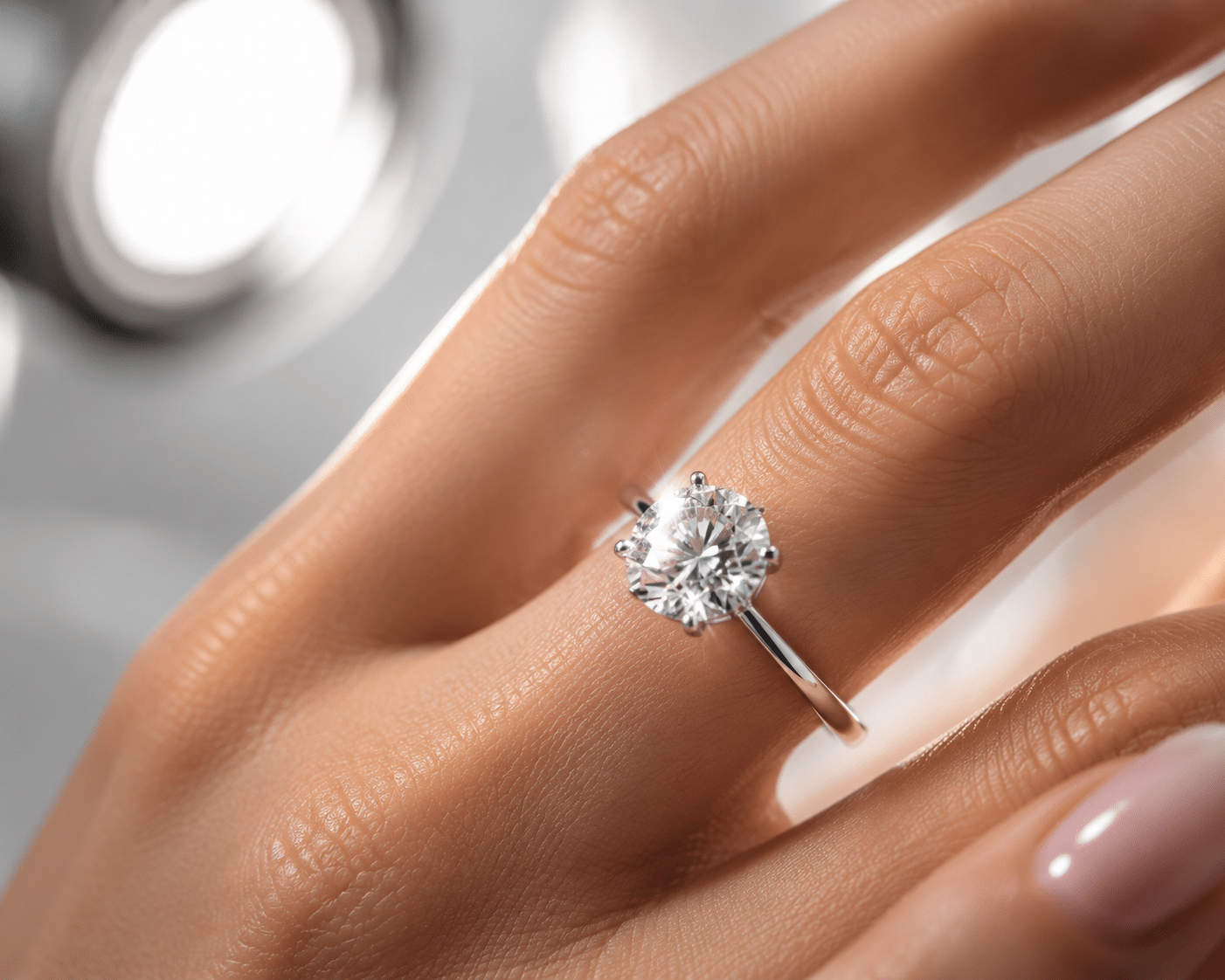
Professional jewelry photography is engineered to sell an idea, not to show you what the ring will look like in your living room. Macro lenses magnify the center stone, making a 0.5-carat diamond read like a 2-carat stone. Focused studio lighting creates maximum scintillation from every angle, which is why stones appear to flash and sparkle in a way they rarely do under a standard ceiling fixture. The model hands used in product shots are often dramatically smaller or larger than average, so a 2mm band that looks substantial in the photo will appear thinner and more delicate on a different hand size. You are not comparing your ring to the actual ring. You are comparing it to a carefully staged image of that ring, shot under ideal conditions with deliberate optical tricks. The U.S. Federal Trade Commission (FTC) has issued guidance cautioning that imagery in jewelry advertising must not mislead consumers about a product’s actual appearance or performance.[1] This principle applies directly to how inspiration photos should be evaluated: the image is often crafted to sell an impression, not to serve as an accurate blueprint for a custom piece.
The Difference Between a Visual Design and an Engineering Problem
A reference photo shows you a finished surface. It does not show you how the prongs are seated, how thick the metal is at the stress points, how the center of gravity interacts with the wearer’s finger, or how the setting will feel after eight hours of wear. These are not decorative details. They are structural requirements. A good custom piece requires balancing aesthetics with engineering: the prong must be thick enough to hold the stone under accidental impact, the shank must have enough metal mass to avoid warping, and the setting height must be low enough to avoid catching on clothing. None of this appears in an inspiration photo, which is why copying a design without understanding its engineering often leads to a piece that looks wrong in person or fails within months.
For buyers, the practical distinction is between what the photo suggests and what the structure actually requires. A setting that looks delicate and refined in an image may only be structurally possible on a smaller hand with a lighter stone. The same proportions copied onto a larger ring size or a heavier diamond can produce a piece that feels unstable or uncomfortable. This is why relying on visual resemblance alone, without evaluating the engineering context, frequently leads to disappointment.
Understanding the Sourcing and Documentation Context
When a reference photo inspires a custom design, the buyer’s attention is usually on the visual result. But the foundation of a reliable custom piece begins well before the CAD software opens — it starts with the documentation and sourcing information attached to the center stone. A grading report from an independent lab such as GIA or IGI provides the stone’s key measurements: length, width, depth, and crown angle.[2] These numbers determine whether the stone fits within the intended setting’s structural limits. For lab-grown diamonds, the report also identifies the growth method and confirms the stone’s laboratory origin, which is essential for transparency in both purchase and resale. Buyers should request a copy of the report before the design phase begins, compare the measurements against the setting’s basket dimensions, and confirm that the stone’s proportions align with the jeweler’s design assumptions. Relying solely on a photo without cross-referencing this documentation introduces unnecessary risk.
What to Check Before You Decide
Before committing to a custom design, ask the jeweler for a video of the actual inspiration piece worn on a real hand, ideally in natural or normal indoor lighting. Request the exact measurements: the stone’s length and width in millimeters, the band width, and the total height of the setting from the finger. Compare these numbers against your own ring size and finger length. If the proportions look different on paper than they did in the photo, trust the numbers, not the image. That difference is the most common reason a custom piece disappoints.
Mistake #1: Copying a Ring Designed for a Different Hand Size and Shape
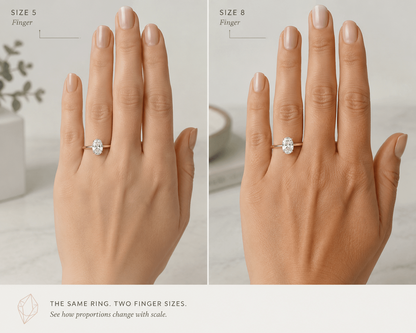
A design that looks elegant and balanced on a size 4 finger can appear heavy, clumsy, or even comically oversized on a size 8 hand. The reverse is also true. A wide band that looks bold and modern on a larger hand can overpower a petite finger entirely. The ring itself did not change. What changed is the relationship between the ring and the hand. This is the most frequent and most preventable mistake in custom jewelry.
The Role of Documentation in Setting Fit — A Further Perspective
When a design intended for one hand size is scaled to another, documentation provides a necessary check. A grading report’s measurement data allows the jeweler to adjust the setting’s proportions — such as the basket width and prong placement — to fit the new stone and hand combination. For example, the report’s documented girdle thickness and culet size directly affect how deeply the stone sits in the basket. Without this data, the jeweler may estimate the fit based on a photo, which can lead to a setting that is too shallow or too tall for the actual stone. Buyers should ask how the stone’s reported measurements will alter the setting’s dimensions when adapted to their ring size, and request a CAD preview that reflects these adjustments. This step helps bridge the gap between the photo’s proportions and the real-world fit.
Proportion Collapse: Why a Setting “Grows” or “Shrinks” on Different Fingers
Ring proportions are relative. A 2mm band on a size 4 finger occupies a significant share of the finger’s width, which makes it look substantial. The same 2mm band on a size 8 finger wraps around a wider circumference and appears thin, even flimsy, by comparison. Similarly, a 1.5-carat oval diamond with a 9x7mm face-up area may look perfectly scaled on a small hand. On a larger hand, that same stone can look noticeably smaller because the visual ratio changes. The setting does not actually grow or shrink. The viewer’s perception of it shifts because the surrounding hand size provides a different reference point. A reference photo shot on a small model hand will not tell you how the ring will look on your own finger.
Finger Length, Knuckle Size, and How the Ring Sits on the Hand
Hand proportions involve more than just ring size. A tall cathedral setting or a high-profile peg head may look graceful in a product photo, but on a short finger, that vertical height can make the finger look even shorter by visually compressing the remaining space. A wide band that sits flush against the base of the finger may feel tight on someone with prominent knuckles who requires a larger size to get the ring past the joint, resulting in a spinning or slipping fit. The ring’s silhouette interacts with the entire hand, not just the finger it sits on. Ignoring these factors during the design phase means accepting whatever compromise emerges after the metal is cast.
The Role of Documentation in Setting Fit
When evaluating a design for a different hand size, the stone’s reported measurements become critical. A grading report lists the stone’s exact dimensions in millimeters, which allows the jeweler to simulate how the stone will occupy space within the setting. For example, a stone with a 7.5mm total depth will push the setting higher off the finger than a stone with a 5.8mm depth, even at the same carat weight. The report also documents girdle thickness and crown angle — factors that determine how much of the stone will sit above the basket. Without reviewing these numbers alongside the CAD preview, the visual impression from the photo can override the physical reality of how the stone will balance on a particular hand. Buyers should request these measurements from the grading report and compare them directly to the setting’s structural envelope before approving the design.
Buyer Verification Checklist
Before finalizing a custom design, confirm your exact ring size and the precise band width in millimeters. Know the actual dimensions of the center stone, measured in length and width, not just in carat weight. Ask the jeweler for a CAD rendering viewed from the top, the side, and in a perspective view that simulates wearing height. Request a comparison image or rendering of the design on a model hand that matches your ring size as closely as possible. If the jeweler cannot show you how the ring will scale to your hand, you are designing blind.
Practical Impact of Wrist and Finger Shape Variation
Beyond ring size and finger length, the shape of the hand and wrist significantly influences how a ring wears throughout the day. Hands with broader palms or thicker bases can cause a ring to sit higher or rotate sideways, especially if the setting is top-heavy. A design that looks beautifully balanced on a slender hand may feel unstable or constantly spin out of position on a wider hand. This is not captured in any photograph. The most reliable way to assess this interaction is through a 3D-printed model that you can wear for an extended period. Holding a wax or resin model on your actual hand, flexing your fingers, and simulating daily motions reveals fit issues that a CAD render or photo never will. If the model shifts, rotates, or feels unstable, the design needs structural adjustment before casting.
Mistake #2: Overestimating How “Blingy” a Diamond or Colorless Stone Looks in Real Life
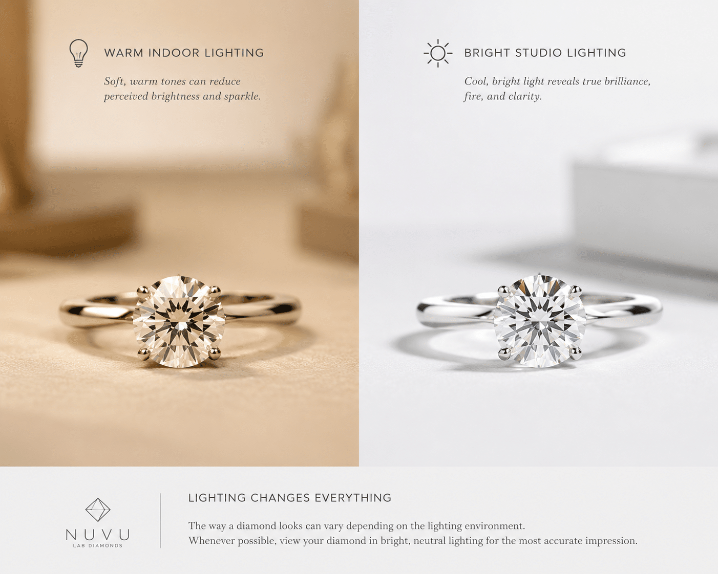
The stone that looked like a fireball in a macro video can appear surprisingly subdued, small, or even dark in normal indoor lighting. This is not a defect in the stone. It is a mismatch between how the stone was shown to you and how it will be seen in daily life. Buyers who fall in love with a stone under optimized studio conditions are often disappointed when the same stone sits quietly under office lighting or at a dinner table.
Contextual Awareness in Real-World Viewing
One reason for this mismatch is that a stone’s visual performance depends on the lighting environment in which it is evaluated. A grading report documents cut quality and proportions — such as crown angle and pavilion depth — but these numbers are measured under controlled conditions that do not reflect the variability of normal daily light. For example, a stone with a steep pavilion angle may perform well under directional studio lights but appear dark in ambient indoor lighting. Similarly, a diamond’s color grade, as noted in the report, describes its tint relative to a master set under specific lighting, but does not predict how the stone will appear against a particular skin tone in warm or cool light. Buyers should view the stone under multiple lighting types — overhead, window, and shaded outdoor — before finalizing their choice. The grading report is a starting point for quality, not a guarantee of visual appeal across all environments.
The Difference Between Studio Lighting and Real-World Light
Jewelry videos and product photos are shot under multiple directional lights designed to excite maximum brilliance, fire, and scintillation. A stone that looks brilliant in these conditions may perform differently under a single overhead fixture, soft ambient light, or overcast natural light. Some diamonds and colorless moissanites that are cut specifically for extreme brightness under macro lenses, a topic addressed in custom jewelry budget guide for fund allocation between lab grown diamonds, metal, and design work, can appear glassy, flat, or hollow in person because they rely on intense directional lighting to create their visual effect. A well-cut stone should perform well across lighting conditions, not just in a spotlight.
White Stones on White Skin: The “Ghost Ring” Problem
A colorless diamond or moissanite set in white gold or platinum against pale skin can visually disappear, especially in low or diffused light. The contrast that made the stone pop in a photo shot against a black velvet background is simply missing in real life. The stone becomes a faint shimmer rather than a clear focal point. This is most noticeable in engagement rings worn daily, where the intended impression of a bright, present stone can feel muted or absent under normal conditions. Buyers with lighter skin tones who want a pronounced visual contrast should give serious thought to how their stone will read against their hand in typical lighting environments.
Worth considering: a diamond’s grading report will document color, clarity, and cut, but it does not measure how the stone will contrast with your skin tone or how it will appear under diffuse indoor light. Those factors depend on personal observation, not certificate data.[2] For many buyers, the most useful test is to view the stone in the same lighting conditions where the ring will be worn most often — typically ambient or indirect light — rather than relying on a display case or studio shot.
How to Verify This Before Buying
Ask to see the actual stone under a standard overhead light or natural window light before committing to a design. If you are buying a loose stone online, request a video taken in diffused indoor lighting with no macro lens, not a close-up studio reel. If you find that the stone loses visual presence against your skin tone or in normal light, consider a tinted center stone such as a light champagne, rose, or very light gray diamond. A warm metal color such as rose gold or yellow gold can also help maintain contrast by separating the stone from the skin visually.
How the Grading Report Can Help — and Where It Falls Short
A grading report from an independent lab such as GIA or IGI documents a stone’s cut grade, color, clarity, and carat weight, providing an objective baseline for comparing diamonds.[2] However, these reports are created under standardized lighting conditions that do not replicate how the stone will appear in your daily environment. For example, a diamond graded as “D” color and “IF” clarity will be highly brilliant under a lab’s diffused light, but that same stone can appear muted or flat under a single overhead bulb at home. The report also does not account for how the stone interacts with your skin tone. A grading document is a reliable tool for verifying quality, but it is not a substitute for seeing the stone in person under realistic conditions. Always combine the certificate data with direct visual observation before finalizing your purchase.
When a grading report is available, buyers should verify the report details through the issuing laboratory’s official report-check tool where available. This step confirms that the report number matches the documented stone properties, providing a separate layer of confirmation beyond the seller’s description.
Managing Expectations for Lab-Grown Diamond Appearance
For buyers considering laboratory-grown diamonds, the visual performance under different lighting conditions follows the same principles as natural diamonds. A lab-grown diamond’s grading report will document its cut grade, color, and clarity, but these measurements are also taken under standardized lighting. The report may note the growth method — such as HPHT or CVD — and provide an inscription identifying the stone as laboratory-grown, but it does not include a rating for brilliance in ambient light or contrast against skin tone. Buyers should not assume that a high cut grade guarantees the stone will look bright in every environment. Viewing the lab-grown diamond under the same varied lighting conditions recommended for natural diamonds — overhead, window, and shaded outdoor light — is the most reliable way to assess its real-world appearance. The grading report serves as a quality baseline, but direct visual evaluation remains essential.
Mistake #3: Ignoring How the Setting Becomes the Weakest Link
The stone gets most of the attention, but the setting is what keeps the ring functional. A fragile setting can turn a carefully chosen diamond into a loose stone waiting to fall out. Many inspiration photos obscure this reality because macro shots do not reveal metal thickness or structural weak points.
Prong Failure: Thin Wire Settings That Snap or Bend
The prongs in a photograph often look barely visible, giving the ring an airy, floating appearance. What is rarely shown is how those same prongs hold up after six months of normal wear. Prongs made from wire thinner than 0.5mm are prone to bending when a hand is slipped into a pocket or caught on a bag strap. Once bent, they no longer hold the stone securely. The industry standard for a durable four-prong or six-prong setting ranges from 0.7mm to 1.0mm per prong. That difference may seem small, but it is the line between a ring that lasts decades and one that needs repair within the first year.
Another factor worth considering is the prong’s shape and finish. A prong that is simply left as a straight wire post may look sleeker in a photo but provides less grip on the diamond’s girdle than a prong with a slightly rounded, re-tipped end. Similarly, a shared-prong setting—where two adjacent stones share a single prong—can reduce visible metal, but it also means that one damaged prong compromises two stones. These are structural tradeoffs that are invisible in a reference image but directly affect long-term durability.
Pavé and Bead Setting: When Tiny Diamonds Fall Out Without Visible Damage
Pavé bands create continuous sparkle by setting tiny melee diamonds directly into the metal. In well-made pieces, each stone is secured by small beads of metal that are shaped and polished over the girdle. In poorly executed copies, the beads are too shallow or the metal wall between stones is too thin. The result is predictable: one day a small diamond is simply gone, and there is no obvious sign of damage because the setting never fully held it in the first place. Stones smaller than 1.0mm are especially vulnerable. The visual appeal of maximum stone coverage often comes at a direct cost to structural hold.
The Role of Documentation in Evaluating Setting Durability
When reviewing a custom design for durability, the grading report for any melee diamonds can provide useful context. A report documenting the melee stones’ measurements, cut quality, and clarity helps the jeweler determine the appropriate depth for bead or channel settings. Stones with an uneven girdle or poor cut symmetry, as noted in the report, may require more metal to secure them properly. Buyers should ask whether the melee diamonds used in pavé or channel settings have individual grading data or are sold as a matched set, and how that documentation influences the setting technique. This inquiry places the report’s data in a practical context: the goal is not to prove that the setting is durable, but to use the stone measurements to confirm that the setting can hold each stone securely.
Stone-to-Setting Fit Check
Before approving a custom design, ask for the exact prong thickness in millimeters. If the number is below 0.7mm, question whether the jeweler has reinforced the design in another way or is simply replicating a fragile look. For pavé or channel-set bands, request a written policy on melee stone replacement within the first year. A jeweler confident in their setting work will not hesitate to provide this. Finally, verify that the shank has adequate metal mass at its lowest point and at the base of the head, because these are the stress zones where a ring bends or breaks under normal pressure.
Mistake #4: Choosing a Stone That Does Not Fit the Setting or the Hand
Carat weight is the most commonly quoted number, but it tells you almost nothing about how a stone will actually sit in a setting or look on a finger. Physical dimensions—length, width, depth—determine the fit. Ignoring them is one of the most common reasons a finished ring looks different from what the buyer expected.
The Buyer’s Responsibility in Documentation Verification
A common point of friction in custom jewelry is when the stone’s dimensions, as recorded in the grading report, do not match the assumptions used during the CAD design. Buyers should request a direct comparison between the report’s measurements and the setting’s CAD dimensions before the design is finalized. This includes verifying that the stone’s length and width fit within the setting basket, that the depth does not exceed the allowed prong length, and that the girdle thickness allows for secure prong placement. For lab-grown diamonds, the report’s inscription number should be cross-checked against the stone before it is set. These verification steps do not guarantee a perfect fit, but they reduce the risk of a mismatch between the documented stone and the setting plan.
Ratio Imbalance: Why a Cushion Cut Looks Softer in Real Life Than an Emerald Cut
The length-to-width ratio of a diamond shape changes its entire visual character. A cushion-cut diamond measuring 9x7mm has a ratio of 1.29, which makes the stone look nearly square and soft on the finger. An emerald-cut diamond at 9x6mm has a ratio of 1.5, which creates a noticeably elongated, stepped appearance. A buyer who falls in love with the soft, pillowy look of a cushion in a photo may be surprised by how rectangular and linear an emerald cut appears on their own hand. The shape itself is not the problem. The mismatch happens when the ratio is not considered alongside the wearer’s finger length and preferred silhouette.
For buyers, the useful approach is to compare the stone’s dimensions directly to the width of the finger it will sit on. A stone that is 8mm wide may appear proportionate on a finger that is 16mm across at the base, but the same stone on a narrower finger will cover more surface area and feel visually heavier. This is not a matter of preference — it is a geometric relationship that changes with every combination of stone size and hand size. A CAD preview that shows the stone scaled to your finger width is the most reliable way to assess this before the setting is made.
Hidden Bulk: How Thick Girdles and Deep Crowns Affect Fit and Wearability
Two stones can weigh exactly the same carat weight but sit at very different heights in a setting. The difference comes from girdle thickness and crown depth. A stone with a thick girdle or steep crown angle sits higher above the finger, increasing the total profile of the ring. That extra height makes the ring more likely to catch on clothing and more prone to feeling top-heavy. A deep stone also requires longer prongs or a taller basket, which can make the whole design look unbalanced. The problem is invisible in a top-down photo but immediately noticeable when the ring is worn.
Certificate and Visual Review Check
Before purchasing a loose diamond, obtain the full measurements from its grading report: length, width, total depth, and girdle thickness description. A stone with a 7.5mm total depth will sit significantly higher in the same setting than a stone with a 5.8mm depth, even at the same carat weight. Compare these numbers directly to the setting’s basket height and prong length. If the stone is deep and the setting is already low-profile, the two are incompatible.
It is also worth noting that a grading report documents the stone’s measurements, but it does not evaluate how those measurements interact with a specific setting. That step is the buyer’s responsibility during the design review. The report is a reliable starting point, but the final fit depends on a direct comparison between the stone’s physical dimensions and the setting’s structural envelope.
Verifying Documentation Consistency Before Purchase
For buyers sourcing a lab-grown diamond independently, verifying documentation consistency is an essential step before committing to the setting. A grading report should list the stone’s unique inscription number, which is laser-inscribed on the girdle. Buyers should confirm that the inscription on the stone matches the report number before the stone is set, as mounting makes visual verification more difficult. For stones purchased online, request a short video showing the inscription under magnification to ensure the document and the stone correspond. This cross-check, combined with the report’s measurement data, gives the buyer confidence that the stone’s documented properties — including its laboratory origin and growth method — align with the physical stone before it enters the setting process.
In sourcing conversations, documentation, consistency, and communication often matter as much as the headline specification. A grading report confirms the stone’s objective quality metrics, but the buyer should still evaluate how those metrics translate to the design’s specific structural and visual requirements.
Mistake #5: Misjudging Comfort and Daily Wearability
A ring that looks perfect in a velvet box can become an annoyance by the end of the first week. Comfort is not a detail to add later. It is a design constraint that should be present from the first sketch.
How Grading Reports Inform Wearability Decisions
While comfort is a subjective experience, documentation can inform some wearability decisions. The grading report’s measurement of total depth and girdle thickness provides data on how high the stone will sit, which directly affects the ring’s overall profile. For example, a stone with a reported total depth of 6.5mm will allow the jeweler to design a lower-profile setting than a stone with an 8.0mm total depth, reducing the risk of snagging. Buyers should discuss the stone’s documented depth with their jeweler when deciding on the setting style. This approach uses the report’s data to support a subjective goal—comfort—by giving the jeweler the critical information needed, as outlined in a custom diamond jewelry guide, to build a ring that is both visually appealing and practical for daily wear.
Tall Settings That Constantly Snag and Hit Things
Cathedral settings, peg-head mounts, and trellis designs often rise 8mm to 12mm above the finger. That height creates a dramatic silhouette in photos, but in daily life it means the ring catches on sweater knits, glove liners, car door handles, and the straps of bags or baby carriers. Some buyers cope by taking the ring off repeatedly during the day, which increases the risk of loss. The tradeoff is real: a taller setting allows more light to reach the stone from the side, but it also introduces constant friction with the wearer’s environment.
Many buyers assume that a tall setting is inherently necessary for a large stone, but that is not always the case. A well-proportioned low-profile setting can accommodate a substantial center stone if the basket is designed around the stone’s actual depth and the shank is reinforced at the base. The key question is not whether the setting is tall or short, but whether the height is proportionate to the stone’s dimensions and the wearer’s daily activities. A setting that rises 10mm above the finger may be acceptable for occasional evening wear but impractical for a ring worn during work, exercise, or childcare. Discussing the intended wearing schedule with the jeweler can help determine the right height tradeoff.
Uncomfortable Bands: Sharp Edges, Square Profiles, and Tight Fit Issues
Many inspiration images show bands with sharply squared edges or razor-thin profiles. These designs photograph well because the clean lines catch studio light. On a finger, the same sharp edges dig into the adjacent fingers and create pressure points. A comfort-fit band—slightly domed on the interior—distributes pressure evenly and prevents the ring from cutting into the skin. It is a standard feature in well-made jewelry, but copycat designs often skip it to preserve the visual look of a flat, modern band.
How Metal Choice and Finish Affect Wear Over Time
The metal type chosen for a setting also plays a critical role in how the ring feels and holds up. Platinum is denser and heavier than 14k or 18k gold, which can make a substantial design feel even heavier on the finger. Yellow gold and rose gold are softer than white gold or platinum, meaning prongs may require more frequent retipping, especially in high-wear settings. Some buyers prefer the weight and density of platinum for its long-term durability, while others choose lighter alloys for everyday comfort. The choice between a high-polish finish and a brushed finish also matters: a polished band shows scratches more readily, while a satin or matte finish conceals daily wear but can be harder to refinish. These factors should be discussed with the jeweler before the CAD is finalized, as they influence both the look and the longevity of the piece.
What This Means in a Real Purchase
If the ring is for everyday wear, ask explicitly for a comfort-fit interior profile. Request the total profile height from the top of the stone to the bottom of the band. Anything over 9mm will require adjustment in daily habits. If the design is important but very tall, consider a lower-profile alternative for daily use and reserve the original design for occasions. Some buyers also use a removable silicone ring for active days, which protects both the ring and their peace of mind.
Practical Transparency in Custom Design Communication
For buyers working with a jeweler on a custom piece, transparency in the documentation and communication process builds confidence. Before the final CAD approval, ask the jeweler to confirm how the stone’s documented measurements align with the setting’s structural parameters. Inquire about the metal alloy’s documented hardness and typical wear characteristics for your chosen finish. If the design involves multiple stones — such as a three-stone ring or a band with side stones — request the grading data for each stone to verify consistent color and clarity across the set. For wholesale or special-order scenarios, buyers should ask for written confirmation that the stones supplied match the grading documentation provided, and that any discrepancies in measurements or quality will be addressed before the setting is completed. This level of documentation awareness, while not a substitute for visual inspection, reduces the risk of mismatches between what was planned and what is delivered.
How to Translate an Inspiration Photo Into a Functional Custom Ring
A reference photo is useful as a starting point. The problem is treating it as a blueprint. A real custom ring requires data the photo simply does not contain. The difference between a piece that looks right in an image and one that feels right on the hand comes down to a handful of specific measurements and honest conversations with the jeweler before the CAD stage begins.
Final Documentation Checklist
Before the final CAD approval, compile a checklist of documentation points to verify. Confirm that the center stone’s grading report number matches the stone itself. Cross-check the stone’s length, width, and depth against the setting’s basket dimensions. Verify that any melee stones in pavé or channel settings have consistent documentation. Ensure that the lab-grown origin is clearly stated on the report if applicable. Request a written summary from the jeweler confirming that the stone measurements, setting dimensions, and metal specifications align with the design plan. This checklist does not replace visual inspection or a 3D-printed model, but it provides a structural layer of confidence that the inspiration photo alone cannot offer.
Bring the Photo, But Also Bring the Data
The more precise information you provide upfront, the closer the CAD model will match what you actually want. A photo tells the jeweler about style and silhouette. It does not tell them your ring size, the band width you can tolerate, or the exact dimensions of the stone you have chosen. Carat weight alone is not enough. A 1.5-carat round measures differently than a 1.5-carat oval or emerald cut, and that difference changes how the setting needs to be built.
Provide your jeweler with your ring size, the desired band width in millimeters, and the exact length and width of the center stone. Also clarify how the ring will be worn daily. A ring intended for constant wear needs different structural margins than one worn occasionally. The more data the jeweler has before opening the CAD software, the fewer surprises later.
For NUVU, the goal is to make diamond comparison easier to understand, especially when buyers are weighing report details, visual evidence, design fit, and budget together. Bringing the photo and the documentation — including the stone’s grading report and measurements — helps the jeweler design a setting that accommodates the stone’s actual structure, not just its visual appearance.
Insist on a CAD Preview with Your Ring Size and Stone Measurements
A CAD rendering is only useful if it is built around your actual specifications. If the jeweler uses a generic size 6 hand model or a placeholder stone weight, the proportions shown on screen will not match what you receive. Request a CAD preview that uses your exact ring size and the precise dimensions of the stone you are buying. If the proportions look different from the inspiration photo, that is not necessarily a mistake. It may mean the original photo used a different hand size, a smaller stone, or a thinner band that would not be structurally safe for your design.
Compare the CAD to the inspiration image side by side. Focus on the band-to-stone ratio, the height of the setting from the finger, and the overall visual weight. If the CAD looks noticeably heavier or taller, ask why. The answer is usually honest physics, not a design error.
Request a “Reality Check” Before Casting
Before the design is sent for casting, ask the jeweler a direct question: What would you change if this were for your own hand? A good jeweler will answer honestly, pointing out where the design might be uncomfortable, structurally weak, or proportionally off in a way the photo never revealed. This is the moment to catch problems that hide behind aesthetics, such as a top-heavy stone that will rotate on the finger, a band that will feel sharp against the adjacent fingers, or a prong configuration that looks delicate but will not survive routine bumps.
NUVU’s buyer-first approach is to make the comparison clearer: what the report shows, what the visuals reveal, and whether the stone fits the intended piece. The best custom pieces come from a collaborative evaluation where both the buyer’s visual goal and the jeweler’s structural experience are treated as equally important.
Certificate and Visual Review Check
Before metal is poured, verify every measurement from the CAD against the written quote. Check band width, band thickness, prong dimensions, and total setting height from the finger. If the numbers do not match, ask for a corrected quote. Also request a 3D-printed wax or resin model of the ring in your exact size. Holding a physical model on your hand reveals scale issues that no screen render can show. If the wax model feels bulky, too tall, or just wrong, now is the time to adjust, not after the metal is cast.
For buyers who want extra confidence, a second CAD review after the initial adjustments can be helpful. It allows you to confirm that the changes you discussed with the jeweler are reflected in the updated model. This double-check step is especially useful when the design involves multiple stones, unusual proportions, or a complex setting structure that cannot be fully evaluated from a single angle.
The Value of an Independent Grading Report for Lab-Grown Diamonds
For buyers considering lab-grown diamonds, an independent grading report is especially important. The GIA, IGI, and GCAL all issue grading reports for lab-grown diamonds that document the same 4Cs — cut, color, clarity, and carat weight — as natural diamond reports.[2][3] These reports also include an inscription identifying the stone as laboratory-grown, and, in some cases, document the growth method (HPHT or CVD). This distinction matters for both buyer transparency and resale clarity. A grading report provides an objective, third-party evaluation of the stone’s quality, which helps you confirm that the stone you receive matches the one you paid for. Without it, you are relying solely on the seller’s description. Official grading documentation ensures that the diamond’s characteristics are independently verified, giving you a solid basis for comparing stones and evaluating their fit within your custom design.
Understanding the Distinction in Custom Design Decisions
When choosing a stone for a custom piece, it is important to recognize that laboratory-grown diamonds and natural diamonds have different origins and may carry different documentation expectations. A grading report for a lab-grown diamond will clearly state its laboratory origin, which helps avoid confusion during the design and purchase process. For custom design, this documentation allows the jeweler to confirm the stone’s measurements and quality metrics, just as they would with a natural diamond. The buyer’s evaluation of cut, color, clarity, and carat weight should follow the same careful process regardless of origin. The documentation provides an objective baseline for both assessment and design fit, supporting a transparent purchase decision.
[1] Federal Trade Commission, “Guides for the Jewelry, Precious Metals, and Pewter Industries,” 16 CFR Part 23, last amended 2018. https://www.ftc.gov/enforcement/rules/rulemaking-regulatory-reform-proceedings/guides-jewelry-precious-metals-pewter-industries
[2] GIA, “Diamond Grading Reports,” Gemological Institute of America, accessed 2025. https://www.gia.edu/gia-reports/diamond-grading-report
[3] International Gemological Institute (IGI), “IGI Report Check,” accessed 2025. https://www.igi.org/report-check
Disclosure: This article is for general educational purposes only. Diamond grading, pricing, availability, specifications, and seller policies can change, and readers should verify important details through grading reports, official laboratory tools, seller documentation, or qualified professionals before making a purchase decision. Laboratory-grown diamonds should be clearly distinguished from natural diamonds, and environmental or sourcing claims should be supported by specific documentation. A grading report can document key characteristics, but it should not be treated as a guarantee of beauty, value, or sourcing ethics.