
Emerald cut lab-grown diamonds can look elegant, architectural, and understated, but they are less forgiving than many brilliant cuts, so comparisons with radiant lab-grown diamond cuts can clarify how facet patterns influence sparkle, shape, and perceived size. Their long step facets and open table make inclusions, uneven reflections, windowing, weak symmetry, and body color easier to see. That means a grading report is useful, but it cannot tell the full story of how the diamond will look in real life.
For the full framework, read Lab-Grown Diamond Shapes Guide.
For buyers, the practical point is that an emerald cut should be judged as a visual object first and a specification sheet second. Two stones can look similar on paper while feeling very different face-up, especially once the setting and lighting are part of the picture. The smartest review process compares the report with actual photos, 360 video, and the intended mounting before making a final choice.
This guide helps you judge an emerald cut with the right priorities: clarity placement, proportion, face-up balance, transparency, and movement. Instead of chasing carat weight or assuming two stones with similar certificates will perform the same, you’ll learn how to screen reports, read images and 360 video more carefully, and decide whether a stone’s shape, color, and setting choice support the look you want.
| What to Check | What Looks Promising | What to Avoid |
|---|---|---|
| Clarity | Eye-clean face-up, especially under the table | Dark or central inclusions visible in video |
| Proportions | Balanced shape with a ratio that suits the design | Choosing by ratio alone without viewing the stone |
| Light performance | Broad flashes, contrast, and depth in motion | Pale, flat, see-through windowing in the center |
| Color | Tone that works with the planned metal | Assuming color is hidden like in a brilliant cut |
| Online buying | Report matched with actual photos and 360 video | Buying from certificate details or low price alone |
| Setting choice | Protected corners and a design that preserves geometry | Bulky or distracting settings that hide the cut’s lines |
Quick Questions Before You Read
Q: Is VS clarity always enough for an emerald cut?
Often it is a practical starting point, but inclusion location matters more than the grade alone.
Q: Can two emerald cut lab-grown diamonds with the same report look different?
Yes. Step alignment, transparency, windowing, and face-up balance can vary noticeably.
Q: What length-to-width ratio is best?
There is no single best ratio. Classic, square-leaning, and elongated shapes create different looks.
Q: Should I buy an emerald cut diamond online?
Yes, if you can review the certificate, actual images, and slow 360 video before deciding.
Documentation note: This guide treats grading reports as verification tools, not as beauty guarantees. A report can help confirm that the stone being discussed matches the listed carat weight, measurements, color, clarity, and other recorded characteristics, but it should be read alongside actual visual media. That distinction is especially important for emerald cuts because many of the most important buying concerns are face-up and movement-based.
Laboratory-grown diamonds should be clearly identified as laboratory-grown, and they should not be presented as mined diamonds. Lab-grown diamonds and natural diamonds are both diamonds, but they have different origins, and seller descriptions or grading reports should make that origin clear.
Claim check for buyers: If a listing makes a strong statement about beauty, value, sustainability, origin, or performance, look for the documentation that supports that exact statement. General descriptions can be useful, but they should not replace the more concrete checks: the report, the measurements, actual imagery, video of the specific stone, and clear seller answers about what is visible in normal viewing.
Why Emerald Cut Lab-Grown Diamonds Need a Different Buying Lens
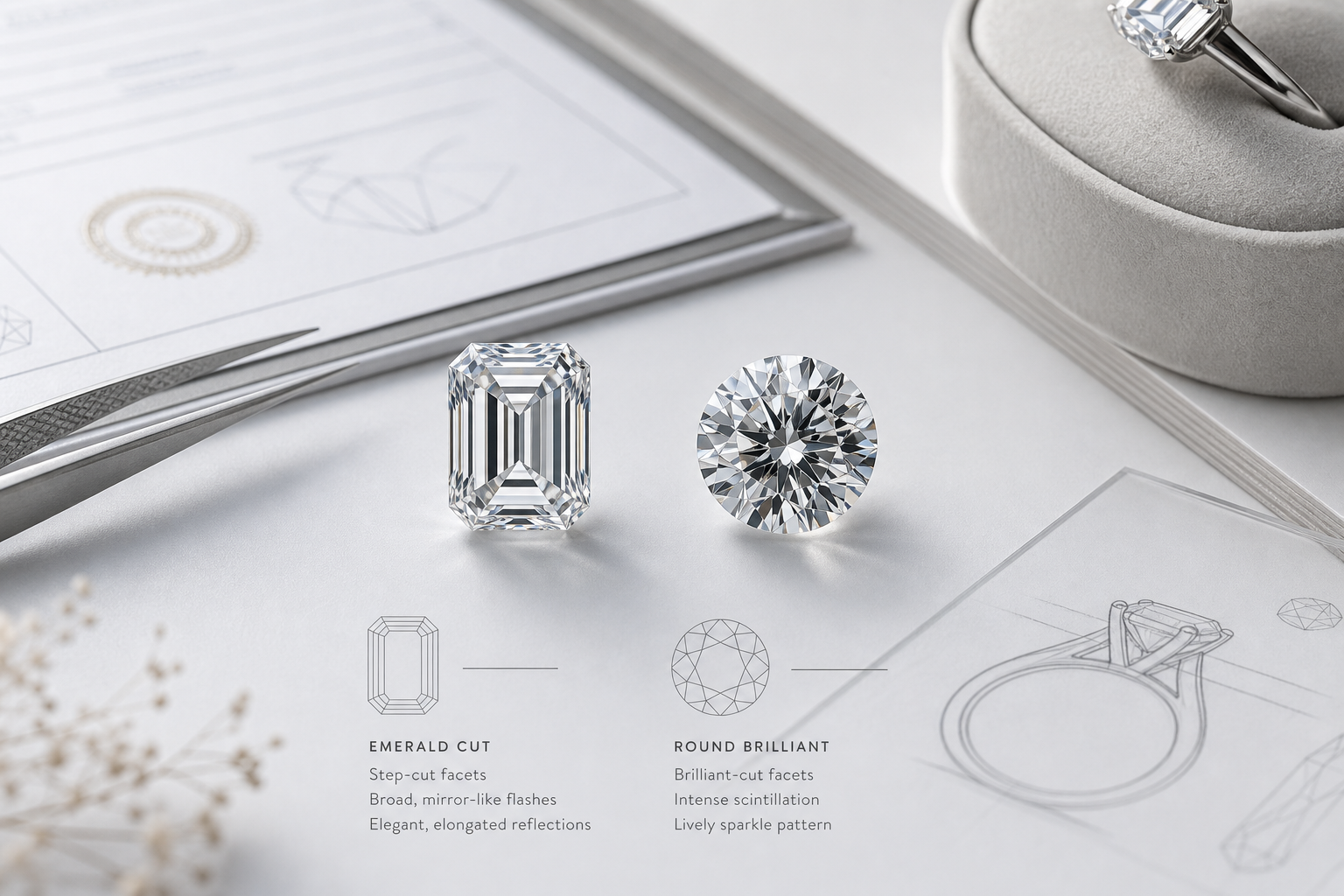
An emerald cut lab-grown diamond should not be judged by the same visual standard as a round brilliant. The goal is not maximum sparkle. The goal is clean structure, balanced geometry, clear step lines, and a calm, glassy elegance that holds up under close viewing.
This is why emerald cut lab-grown diamonds require stricter visual review. A brilliant cut uses many small facets to break light into fast flashes, which can help mask small inclusions, slight unevenness, or less-than-ideal transparency. An emerald cut uses long, open facets arranged in steps. Those facets act more like mirrors than glitter. If something is off, the eye often catches it quickly.
The practical buying standard changes because the stone reveals more of itself. Clarity, symmetry, windowing, and face-up appearance matter earlier in the decision. A large emerald cut with weak structure can look flat or empty, while a slightly smaller stone with cleaner lines can look more refined and more expensive on the hand.
How step-cut faceting changes what the eye notices
Step-cut faceting creates broad flashes instead of scattered sparkle. In a strong emerald cut, the reflections move in clean, deliberate bands across the stone. The effect is quieter than a round brilliant, but it can be striking when the facet pattern is orderly and the center looks alive.
The tradeoff is that emerald cuts do not hide visual issues well. A small inclusion, a cloudy area, or a misaligned facet can interrupt the clean geometry because there is less sparkle to distract the eye. This does not mean every emerald cut needs the highest clarity grade, but it does mean the location and visibility of imperfections matter more than many shoppers expect.
For a buyer, the key question is not “Does it sparkle enough?” but “Does the stone look clean, balanced, and intentional?” If the answer depends only on carat weight or a grade on paper, the review is incomplete.
Why lab-grown origin does not reduce the need for visual review
Lab-grown describes how the diamond was created, not how well a specific emerald cut performs visually. Two lab-grown diamonds with the same carat weight, color, clarity grade, and certification can still look noticeably different face-up.
The difference often comes from details that a buyer cannot judge from the headline grades alone. Transparency, facet alignment, the placement of internal features, and the way the center reflects light can all affect whether the stone feels crisp or washed out. A lab-grown emerald cut can be a strong choice, but the origin does not automatically solve the shape’s visual demands.
At NUVU, we treat the grading report as a starting point rather than the final decision for step cuts, because the report helps narrow the search but does not fully show how the diamond behaves in motion or under normal viewing conditions.
It is also worth separating creation method from cut quality. A lab-grown stone can be beautifully cut, poorly cut, or somewhere in between. The origin category does not automatically establish that the table is attractive, the center is lively, or the step pattern is balanced. For an emerald cut, the better question is whether the specific diamond has the visual discipline this shape requires.
Sustainability or origin-related language should also be read carefully. Lab-grown origin is an important piece of information, but broad environmental claims are only useful when they are specific and supported. Buyers should look for clear, limited information about production context, seller documentation, and what is actually being claimed rather than relying on general green wording.
Environmental and sustainability claims should be specific, documented, and limited to what can be substantiated.
What to notice first in a face-up stone
Start with the face-up view before getting pulled into fine grading details. The outline should look even, the corners should feel balanced, and the length should suit the style you want. If the shape already feels awkward from the top, a higher grade will not fix the visual impression.
Next, look at the step pattern. The lines should feel organized, not busy or broken. The center should not appear like an empty see-through panel, and the reflections should move in a way that gives the stone presence. In an emerald cut, elegance comes from control. If the eye keeps searching for where to rest, the pattern may be working against the stone.
This is also where size can mislead buyers. A larger emerald cut may look impressive in measurements but weak in person if the face-up appearance is flat, uneven, or too transparent. With this shape, visual strength matters more than simply choosing the biggest stone within budget.
What to Check Before You Decide
Before shortlisting an emerald cut lab-grown diamond, confirm that the face-up shape looks balanced, the step alignment feels clean, and the stone reads as elegant rather than merely large. If the stone needs the grading report to convince you it is good, it probably needs closer visual review.
Clarity in Emerald Cuts: What You Can Actually See
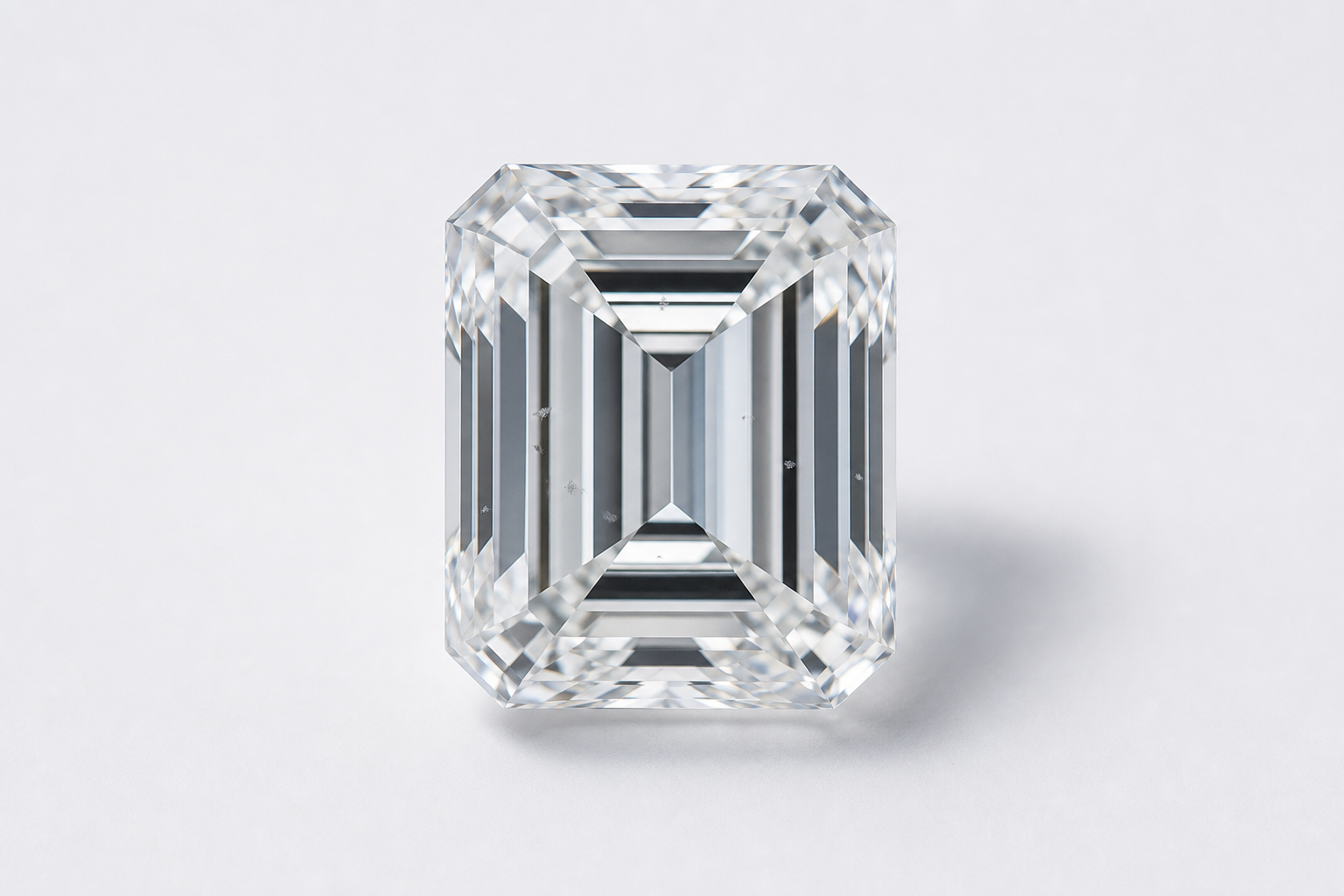
Emerald cut diamond clarity matters because this shape gives the eye a clearer view into the stone. The long, open facets do not scatter light as aggressively as brilliant cuts, so inclusions that might be easy to ignore in another shape can become more noticeable in an emerald cut.
Lab-grown stones can sometimes show growth-related features, but the buying question is still the same: do those features affect the appearance of the diamond face-up? A report may note them in technical terms, yet the only thing that matters for most buyers is whether they are visible, distracting, or positioned where they interrupt the open step-cut look.
The best clarity for an emerald cut lab-grown diamond is not automatically the highest grade a budget allows. The better target is an eye-clean emerald cut: a stone that looks clean to the naked eye at normal viewing distance, especially from the top. A clarity label helps, but the visible experience matters more than the name of the grade.
Why eye-clean matters more than chasing a higher clarity label
“Eye-clean” should mean that inclusions are not distracting when the diamond is viewed face-up in normal conditions. It does not mean the stone is flawless under magnification. Many buyers overpay for clarity they will never see, while missing the more important question: whether anything interrupts the clean, open look of the emerald cut.
For emerald cuts, VS clarity grades are often a practical place to start, but the grade is not a guarantee. Some VS2 stones can look very clean if the inclusions are small, light, or placed near the edge. Some higher-graded stones may still deserve caution if the visible feature sits under the table or disrupts the center reflection. Placement can matter more than the difference between two adjacent clarity grades.
The mistake is treating clarity as a ladder where higher is always better. In real buying terms, a higher grade is only worth paying for if it improves what the eye actually sees or gives the buyer meaningful peace of mind for a larger stone.
Which inclusion types and locations deserve extra attention
Center placement deserves the closest review. An inclusion under the main table can be more distracting than a larger feature closer to a corner or edge, because the center of an emerald cut is visually exposed. The eye naturally looks into that area, especially in videos and close-up photos.
Long internal lines, dark crystals, feathers that follow the step pattern, and clouds that soften transparency all deserve extra attention. The issue is not just whether an inclusion exists. The issue is whether it breaks the clean geometry of the stone. A small dark dot in the wrong place can be more noticeable than several faint inclusions that blend into the structure.
Features near step edges can also draw attention if they appear to interrupt the mirror-like lines. Inclusions that line up with the facet pattern may be less obvious in a still image but more visible as the stone moves. This is why magnified photos should be used carefully: they help identify risk areas, but they can also make harmless features look more serious than they will appear in daily wear.
When a clarity upgrade is actually worth the price
A clarity upgrade is worth considering when the current stone has a visible inclusion in the center, a dark feature that catches the eye in video, or a cloud that makes the diamond look less crisp. It is also more reasonable for larger emerald cuts, where the open table gives the viewer more surface area to inspect.
A clarity upgrade is less compelling when the only difference is a cleaner report but no visible improvement. If two stones look equally clean face-up, the one with the slightly lower clarity grade may be the smarter choice, assuming the inclusion type and location are not a durability concern and the diamond still appears transparent and well-structured.
The decision should be visual first and label second. Paying for clarity makes sense when it removes a real distraction. Paying only to move from one clean-looking grade to another can leave less budget for the details that may matter more in an emerald cut, such as stronger symmetry or better face-up performance.
Prices can change with market conditions, report type, seller channel, and stone-specific details, so exact comparisons should be verified at the time of purchase.
Certificate and Visual Review Check
Use the certificate to identify the clarity grade and any plotted or listed inclusions, then confirm the stone in real viewing media. If the report looks acceptable but the face-up image shows a mark in the center, a dull area, or a broken reflection pattern, the stone deserves closer review. A good emerald cut should not require you to ignore something once you have seen it.
Step-Cut Lines, Symmetry, and the Mirror-Like Pattern
The step cut is the visual identity of an emerald cut. Its long facets create a mirror effect that should feel calm, orderly, and architectural. Because the pattern is so open, emerald cut symmetry and facet alignment are easier to notice than many buyers expect.
Polish and symmetry grades on a certificate are useful, but they do not fully tell you whether the stone looks graceful in motion. A diamond can carry respectable grades and still appear slightly unsettled if the step pattern feels uneven, if one end looks visually heavier, or if the reflections do not move with the same rhythm across the face-up view.
In a strong stone, the eye moves smoothly through the center and along the sides. In a weaker one, the pattern can look crooked, uneven, or restless, even if the diamond has attractive grades on paper. This is one of the clearest signs of how emerald cuts differ from brilliant cuts: the beauty depends on visual order, not sparkle density.
What clean step alignment looks like in a face-up view
Clean step alignment looks like a series of organized reflections that follow the shape of the stone. The lines should feel parallel and controlled, with no obvious section that looks collapsed, jagged, or randomly bright. The center should have structure, not a blank or chaotic appearance.
The strongest emerald cuts often have a visual rhythm. As the diamond moves, the reflections turn on and off in broad bands rather than scattered flashes. That rhythm is what gives the shape its refined look. If the facets do not line up well, the stone can lose that quiet confidence and start to look flat or visually noisy.
A buyer should not expect machine-perfect uniformity in every frame of a video, but the overall pattern should make sense. If the step lines seem to fight the outline or pull attention to one side, the diamond may look less elegant once set in a ring.
How symmetry shows up in the center, sides, and corners
Symmetry is not just a report grade. In an emerald cut, it shows up in the way the center line sits, how evenly the side steps frame the stone, and whether the clipped corners support the rectangular outline. A stone can have acceptable symmetry on paper and still look slightly off if the visual balance is weak.
The center should not appear pushed to one side or visually heavier on one end. The side facets should create a balanced frame rather than making one edge feel brighter, darker, or more compressed than the other. Corners matter because they finish the architecture of the cut. If they look uneven, too sharp, or mismatched, the entire outline can feel less polished.
This becomes especially important in engagement rings, where the diamond is viewed from many angles throughout the day. A minor asymmetry that seems tolerable in one still photo can become more distracting in motion, particularly with a minimalist setting that leaves the stone’s geometry exposed.
Red flags that make the stone look uneven or distracted
The clearest red flags are broken flow, lopsided reflections, and a pattern that makes the eye jump around instead of settling into the stone. If one side looks busier than the other, or the center appears oddly empty while the edges flash strongly, the diamond may lack the balanced mirror effect that gives emerald cuts their appeal.
Watch for corners that do not match, step lines that appear tilted, and reflections that look patchy rather than organized. These issues are not always captured by a single grade, and, as with oval lab grown diamond proportions, they can be difficult to correct through setting choice. A setting can frame the stone, but it cannot make uneven facet alignment look clean.
The practical judgment is simple: if the pattern distracts you now, it is unlikely to become less noticeable after purchase. Emerald cuts reward buyers who are selective about symmetry because the shape does not give much visual cover to weak craftsmanship.
How to Verify This Before Buying
Review the diamond face-up first, then watch the 360 video slowly. Look for steady step alignment, balanced corner shape, and reflections that move evenly across the stone. Pause the video at several angles. If the center shifts awkwardly, one side repeatedly looks heavier, or the corners appear mismatched, ask for additional media or keep looking.
Proportion Matters: Length-to-Width Ratio, Table, and Depth
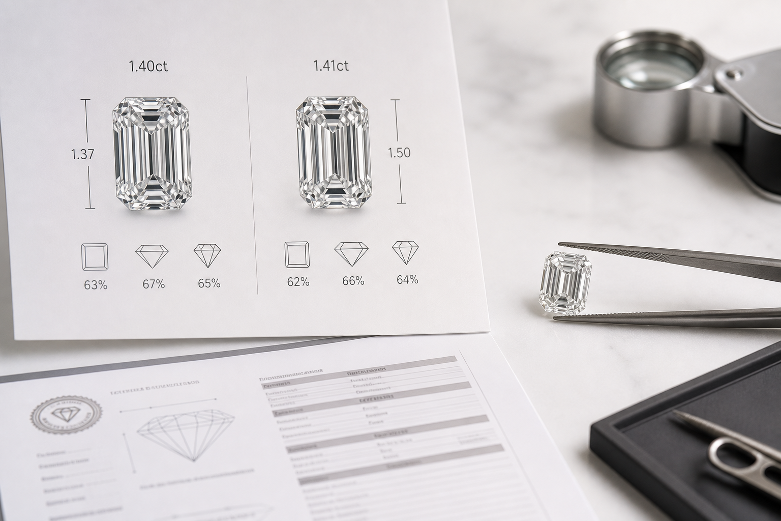
Proportion is one of the fastest ways to tell whether an emerald cut looks elegant or awkward. The length-to-width ratio sets the overall personality of the stone, while table and depth influence how the diamond carries its size, reflects light, and holds visual balance. These numbers are useful, but they should be treated as filters, not final proof of beauty.
For custom design, these measurements also affect the setting choice. A ratio that looks ideal in a loose stone may feel different once prongs, a bezel, or side stones are added. That is why the proportions should be checked against the finished design, not just compared with a general preference for “long” or “square.”
A well-proportioned emerald cut should look intentional from the top view. If it is too short and broad, it can lose the long, architectural feel many buyers want from this shape. If it is too narrow, it may look sharp or stretched rather than refined. The goal is not to chase one perfect measurement. The goal is to find a stone whose outline, corner geometry, and face-up presence work together.
Which length-to-width ratios usually look classic, square-leaning, or elongated
The best length-to-width ratio for an emerald cut depends partly on personal taste, but certain ranges create predictable visual effects. A classic balanced emerald cut often falls around 1.30 to 1.45. This range usually gives the stone enough length to feel elegant without becoming overly slim. For many engagement rings, it is the safest starting point because it looks clearly rectangular while still carrying good presence across the finger.
A ratio around 1.20 to 1.29 creates a more square-leaning emerald cut. This can work well for buyers who like a softer, broader look, but it can also move close to an Asscher-like feel if the stone becomes too compact. That is not automatically a problem, but it changes the mood. If the buyer wants the crisp, elongated identity of an emerald cut, this lower ratio range needs extra visual confirmation.
A longer, slimmer appearance often falls around 1.46 to 1.60. This can look striking and refined, especially for someone who wants a more lengthened silhouette. The risk is that the stone may begin to look narrow for its carat weight, with less visual spread than expected. A long emerald cut should still feel balanced, not like a rectangle that has been pulled too far in one direction.
These ratio ranges are most useful when comparing stones side by side. A 1.38 and a 1.52 emerald cut may both be attractive, but they will not deliver the same visual personality. The mistake is choosing by carat weight first and only noticing the outline later. With emerald cuts, the outline is not a minor detail; it is the frame for the entire stone.
How table and depth support or weaken presence
Table and depth help explain why two emerald cuts with similar carat weight can look very different face-up. As a practical starting filter, many buyers look for table and depth measurements in the roughly 60% to 70% range, then confirm the stone with images and video. This is not a rigid rule. A stone slightly outside that range may still look good, while a stone inside the range can still look flat, dark, or poorly balanced.
The table affects the size of the open top facet. If the table feels too large in relation to the rest of the stone, the emerald cut may look glassy or overly plain, with less of the layered step pattern that gives the shape its character. If the table feels too small, the diamond may look tight or visually crowded. The right table should support the step-cut geometry without making the center feel empty.
Depth affects how the stone carries weight and how large it appears from the top. A very deep emerald cut can hide weight underneath the stone, making it look smaller than another diamond of the same carat weight. A very shallow stone may appear larger on paper but can increase the risk of weak light return or a washed-out center. Face-up size matters, but not if it comes at the cost of presence.
The practical judgment is simple: use table and depth to screen out obvious proportion concerns, then trust the visual review. If the measurements look reasonable but the diamond appears dull, overly transparent, or visually uneven in motion, the numbers are not strong enough to rescue it.
Why corner shape and outline change the final impression
Corner geometry has more influence than many buyers expect. Emerald cuts have cropped corners, and those corners help define whether the stone feels formal, soft, broad, or sharply architectural. Corners that are too small can make the outline feel closer to a plain rectangle. Corners that are too large can make the shape look shortened or less graceful.
The outline should also look even from end to end. If one side feels slightly heavier, one corner looks different from the others, or the ends appear too wide for the body, the stone may feel visually unsettled even if the ratio looks appealing. This is especially important online, where a listing may highlight the carat weight and grading details while the actual silhouette receives less attention.
A strong emerald cut does not need an extreme outline to stand out. In most cases, balance is more valuable than drama. A slightly elongated stone with clean corners and a steady outline will usually look more refined than a larger stone with awkward geometry.
Stone-to-Setting Fit Check
Before choosing an emerald cut, confirm that the measurements support the intended ring design. A longer ratio can look elegant, but it may require a setting that visually supports the length. A square-leaning emerald cut can look substantial, but it may not create the elongated effect some buyers expect. The stone should not be judged as a loose diamond only; it should be judged as the center of the finished piece.
A useful checkpoint is to compare the length, width, ratio, table, depth, and face-up image together. If the numbers suggest balance and the top view confirms a clean outline, the stone deserves closer review. If the measurements look appealing but the diamond feels too narrow, too blocky, or visually heavy in one area, keep looking.
Color and Tone: Why Emerald Cuts Show More Than You Expect
Emerald cut color can be more noticeable than buyers expect because step cuts do not break up light the same way brilliant cuts do. The broad facets and open visual structure can make body color easier to see, especially in larger stones or stones viewed against white metal. This does not mean every emerald cut needs the highest color grade. It means the color decision should be made with the shape, setting metal, and personal tolerance for warmth in mind.
Lab-grown diamond color is graded on the same general scale as mined diamond color, but the grade alone does not tell the full story of how a stone will look in a ring. Two stones with the same color grade may face up differently depending on cut, depth, lighting, and surrounding metal. For emerald cuts, the practical question is not only “What is the grade?” but “Does the tone interrupt the clean, crisp look of the stone?”
Why body color can be easier to notice in step cuts
Body color tends to show more readily in emerald cuts because the eye looks into broader, calmer facets. In a round brilliant, strong sparkle can distract from a slight tint. In an emerald cut, there is less visual noise to hide warmth, so a faint yellow, brown, or gray tone may be easier to pick up, especially through the center and along the longer sides.
This matters most when the buyer wants a cool, icy appearance. If that is the goal, a stone that looks only slightly warm in listing photos may appear more noticeably tinted once placed in a white gold or platinum setting. Larger emerald cuts can make this more obvious because there is more open surface area for the eye to read.
The common mistake is assuming that a color grade that looked acceptable in a round diamond will behave the same way in an emerald cut. Step cuts are less forgiving. If color sensitivity is high, prioritize face-up tone early rather than treating it as a final detail.
How metal color changes the apparent tint
Metal choice can either emphasize or soften the appearance of tint. White gold and platinum tend to create a cooler frame, which can make warmth in the diamond more noticeable by contrast. This does not mean a slightly warm emerald cut cannot work in white metal, but the buyer should review the stone carefully in neutral lighting before assuming the grade will look crisp enough.
Yellow gold is more forgiving of warmth because the metal itself carries a warm tone. A diamond with a slightly warmer body color may blend more naturally into yellow gold than it would in platinum. This can be a smart tradeoff when the warmth is subtle and the stone performs well in proportion, clarity, and visual balance.
Rose gold can also soften the impression of warmth, though it may shift the overall look of the ring more noticeably. The key is to match the diamond’s tone with the intended design rather than choosing color in isolation. A stone that feels like a compromise in one metal can look intentional in another.
When a slightly warmer stone can still be the right value
A slightly warmer emerald cut can still be a strong choice if the tint is not distracting face-up and the rest of the stone is visually strong. If the diamond has clean step alignment, pleasing proportions, and good transparency, accepting a bit of warmth may be more sensible than paying for a higher color grade that does not create a meaningful visible improvement.
The tradeoff becomes weaker when the warmth works against the look the buyer wants. If the goal is a crisp, bright, very white emerald cut in platinum, color should be given more weight. If the ring will be in yellow gold, or if the buyer prefers a softer antique-inspired tone, a slightly warmer stone may fit the design better than a colder one.
The worst approach is to buy color by grade alone. A higher color grade with poor visual performance is not a better emerald cut. Color matters, but it should not outrank the basic face-up impression of the stone.
What This Means in a Real Purchase
When reviewing color, compare the diamond against the metal you actually plan to use. If possible, look at images or video under neutral lighting rather than only bright studio light. Ask whether the stone looks clean and balanced from the top, or whether the tint becomes the first thing your eye notices.
For most buyers, the right color grade is the one that supports the desired ring style without forcing unnecessary tradeoffs elsewhere. If the stone looks bright, even, and harmonious in the intended setting, a slightly warmer grade may be acceptable. If the warmth distracts from the step-cut elegance, it is worth moving up in color or choosing a different stone.
Windowing, Transparency, and the Difference Between Bright and Flat
Windowing, transparency, and flatness are some of the most important visual issues in an emerald cut because they can make a stone disappoint even when the grading report looks strong. A flat emerald cut may have good clarity, a desirable color grade, and attractive measurements, yet still look weak because the center does not return light in a satisfying way.
Emerald cuts are meant to have a clear, open look, so transparency itself is not the problem. The issue is whether the stone looks alive. A good emerald cut should show contrast, broad flashes, and a sense of depth. A weaker stone may look see-through, washed out, or strangely empty in the center, especially when viewed face-up.
What a window looks like in an emerald cut face-up view
A window in an emerald cut often appears as a pale, overly transparent area through the center of the stone. Instead of seeing layered reflections or alternating light and dark steps, the viewer sees through the diamond too easily. The center can look like a flat glass panel rather than a reflective gemstone.
The easiest way to think about it is this: a bright emerald cut reflects light back to the eye in an organized way, while a windowed stone lets too much of the background show through. In photos, this can appear as a washed-out center. In video, it may show as an area that stays lifeless while the rest of the diamond moves.
This problem is especially important in emerald cuts because the center is visually exposed. In a more brilliant shape, sparkle can distract from weak zones. In an emerald cut, a dead center is hard to ignore.
How to separate healthy transparency from deadness
Healthy transparency is part of the appeal of an emerald cut. The stone should look clean, open, and calm. It should not look like a crushed-ice shape, and it should not be judged by the same sparkle standard as a round brilliant. The question is whether that openness is supported by reflection and contrast.
A strong emerald cut usually shows broad flashes that turn on and off as the stone moves. The steps should create a rhythm, not a static sheet of glass. Some areas will appear lighter and some darker, but the pattern should feel intentional. If the whole stone looks evenly pale, watery, or inactive, the transparency has crossed into deadness.
Normal transparency lets you appreciate the clarity and structure of the cut. Problem transparency makes the diamond feel thin, flat, or lacking in substance. That difference matters more than a small grade improvement on paper.
Why a stone can look clean on paper but dull in person
A grading report can confirm measurements, color, clarity, and other important details, but it cannot fully show light behavior. This is where many emerald cut buying mistakes happen. A buyer may choose a stone because it appears clean and well-graded, only to find that it lacks contrast or presence in real viewing conditions.
Clarity does not guarantee liveliness. A high-clarity emerald cut with weak proportions or poor light return can still look dull. Likewise, a stone with a slightly lower clarity grade may look more appealing if the inclusions are not visible and the step pattern has better movement.
The practical priority is to evaluate visual performance before treating the specs as a final decision. If the diamond does not look engaging in photos and 360 video, stronger numbers will not necessarily make it more satisfying in person.
Buyer Verification Checklist
To check for windowing, look at the face-up video and watch the center of the stone as it moves. A healthy emerald cut should show changing reflections through the middle, not a large area that stays pale and see-through. If the background seems visible through the center, or if the diamond looks watery from several angles, the stone needs extra caution.
Review the diamond under more than one lighting condition when possible. Bright studio lighting can make a weak stone look cleaner than it will in daily wear, while poor lighting can make a good stone look darker than it really is. The best available media should show enough movement to judge whether the emerald cut has depth, contrast, and life.
If the stone looks clean on paper but flat in motion, keep looking. For emerald cuts, a lively face-up appearance is not a bonus detail; it is one of the main reasons the shape works.
How to Review an Emerald Cut Online Before You Buy
An emerald cut is one of the shapes where a grading report, 360 video, and diamond listing need to be read together. The report narrows the field, but it cannot tell you whether the stone has a calm, balanced face-up appearance. Photos can show shape and contrast, while video helps reveal how the step facets move. If one of those pieces is missing or unclear, the purchase becomes more speculative than it needs to be.
In practical buying, the most common problem is not lack of information but uneven information. A seller may provide a strong certificate and a polished description, while the actual media gives only a partial view of the center, corners, or transparency. If the diamond is hard to inspect, treat that as a reason to slow down rather than a small inconvenience.
The most reliable online review starts with filtering, then moves into visual judgment. Use the certificate to confirm the basics, use images to judge the outline and transparency, and use motion to check whether the stone looks organized or flat. For emerald cuts, a stone with attractive numbers can still disappoint if the center looks see-through, the steps feel uneven, or the reflections break in a distracting way.
What the grading report can tell you
The grading report should confirm the diamond’s carat weight, measurements, color, clarity, polish, symmetry, fluorescence if listed, and identifying details. For an emerald cut, the measurements matter more than many buyers realize because they explain how the carat weight is distributed. Two diamonds with the same carat weight can face up very differently if one carries more weight in depth and the other spreads more cleanly across the top.
Pay close attention to length, width, table, and depth before getting attached to the carat number. A heavier emerald cut is not automatically the better-looking stone if the outline feels too narrow, too squat, or visually underwhelming for its weight. The report can also help you avoid obvious mismatches between the listed description and the actual certificate data.
The limit is just as important: a certificate does not show the stone’s personality. It does not prove that the center looks lively, that the step pattern feels even, or that inclusions are harmless in real viewing, which is why lab grown diamond shapes should be assessed alongside grading data for price, visual spread, and daily wear. At NUVU, we treat the grading report as the starting point for comparison, not the final buying answer, because emerald cuts depend heavily on face-up behavior.
A grading report helps document key characteristics, but it should not be treated as a guarantee of beauty, value, or sourcing ethics.
How to avoid over-reading a report
A grading report should be read carefully, but not stretched beyond what it records. If the report lists color, clarity, measurements, polish, and symmetry, those details can help you compare candidates. They do not automatically prove that one emerald cut has better visual rhythm, more attractive corner geometry, or stronger face-up life than another stone with similar headline grades.
This matters because online listings sometimes make a report feel like the whole decision. For an emerald cut, the report should answer identity and specification questions first. The photos and video should answer appearance questions. If a listing uses the report to imply more than it actually shows, the buyer should return to the practical evidence: exact-stone media, face-up review, and clear confirmation of visible inclusions or windowing.
A useful way to stay disciplined is to separate “documented” from “observed.” Carat weight, color grade, clarity grade, and measurements are documented on the report. Step alignment, liveliness, face-up cleanliness, and whether the center looks distracting are observed through images, video, and direct viewing. The safest purchase is one where both kinds of evidence point in the same direction.
How to use photos and 360 video together
Still photos are useful for judging outline, corner shape, color impression, and whether the stone looks clean from the top. A good image should let you see the rectangular frame, the cut corners, and the internal step pattern without excessive editing or overly dramatic lighting. If every photo is highly stylized, heavily shadowed, or shown only at an angle, it may hide the exact issues that matter most in an emerald cut.
A 360 video answers a different question: how the stone behaves when it moves. Watch the center first. It should not stay washed out across most of the rotation, and the reflections should not collapse into a large see-through area. Then look at the sides and corners. The best videos show whether the steps turn on and off in an orderly way or whether the pattern feels uneven and restless.
Do not judge an emerald cut by one flattering frame. Pause the video at several points and look for consistency. A stone does not need to flash aggressively like a round brilliant, but it should have controlled contrast and a clear rhythm. If it only looks attractive for a second and then becomes dull, dark, or transparent for the rest of the rotation, the listing deserves more questions before you move forward.
Questions to ask about measurements, media, and confirmation
Before placing an order, ask questions that fill the gap between the certificate and the visual media. The goal is not to interrogate the seller; it is to confirm that the diamond has been represented clearly enough for an online decision. Vague answers are a warning sign, especially with a shape that depends so much on visual balance.
- Are the listed measurements taken directly from the grading report, and do they match the certificate number?
- Is the video of the exact diamond being sold, not a sample or representative stone?
- Can the stone be shown face-up under neutral lighting rather than only in high-contrast studio lighting?
- Are any inclusions visible to the unaided eye from the top view?
- Does the center show any windowing or persistent see-through areas in normal viewing?
- Can the seller confirm whether the stone has been reviewed for step alignment and overall face-up balance?
The most useful answer is specific and visual. “The diamond is VS1” is less helpful than “the inclusion is near the edge and not visible face-up at normal viewing distance.” For emerald cuts, that distinction matters because the placement of a feature can be more important than the grade name attached to it.
Documentation and Media Check
A diamond listing is strong enough to support a confident purchase only when the certificate, photos, and 360 video agree with each other. The report should confirm the identity and measurements. The photos should show the outline, color impression, and face-up cleanliness. The video should confirm movement, contrast, and step behavior.
If any one piece is weak, slow down. A missing certificate, unclear measurements, stock video, or overly edited image set should not be treated as a minor inconvenience with an emerald cut. This is the point where asking for better media is smarter than hoping the stone looks better in person.
When a grading report is available, buyers should verify the report details through the issuing laboratory’s official report-check tool where available, then compare those details with the exact stone’s measurements, inscription information, photos, and video.
For a certificate-aware purchase, the safest workflow is to match the report number, measurements, and inscription details before judging the stone’s beauty. Labs such as GIA, IGI, and HRD Antwerp provide standardized grading language, but buyers should still confirm that the document belongs to the exact diamond being considered. This step is especially important when comparing emerald cuts online because two visually different stones can share similar headline grades.
Clear communication from the seller is also part of the trust process. A reliable review should be able to explain what is documented by the lab, what is visible in the actual media, and what remains a matter of style preference. For emerald cuts, helpful guidance does not push every buyer toward the highest grade; it helps identify whether the specific diamond’s clarity placement, proportions, tone, and step-cut movement support the intended ring.
For NUVU, the goal is to make diamond comparison easier to understand, especially when buyers are weighing report details, visual performance, setting fit, and budget together. A grading report can narrow the search, but the final shortlist should still be based on the exact emerald cut’s face-up behavior and whether its measurements support the jewelry being planned.
Settings, Wearability, and the Right Ring Style
An emerald cut engagement ring works best when the setting supports the stone’s geometry instead of competing with it. Because the shape is clean, linear, and transparent, the mounting has a stronger influence on the final look than many buyers expect. A setting can make the diamond feel crisp and architectural, or it can make the same stone look busy, smaller, or visually boxed in.
For custom jewelry, this is where measurements matter again. Prong placement, band width, and the way the setting surrounds the corners should be checked against the exact stone, not only against a general style inspiration. A ring that looks balanced in a design sketch can feel too crowded if the center stone has a different ratio or depth than expected.
The right choice depends on the stone’s proportions, the wearer’s lifestyle, and whether the goal is a sleek everyday ring or a more decorative design. A beautiful loose diamond still needs a setting that protects the corners, holds the stone securely, and preserves the step-cut character that made the emerald cut appealing in the first place.
For custom jewelry, stone measurements and setting compatibility should be confirmed before finalizing a purchase.
Which settings flatter the rectangular outline most consistently
Simple solitaire settings are often the safest choice for an emerald cut because they let the rectangular outline and step pattern stay visible. A four-prong setting can look clean and open, but the prongs need to protect the clipped corners without overwhelming them. If the prongs are too bulky, they can make the ends look heavy and interrupt the stone’s sharp outline.
A bezel setting offers more edge protection and can create a polished, modern frame. It is especially practical for someone who is hard on rings or wants a smoother profile. The tradeoff is that a bezel can make the stone appear more enclosed, and if the bezel is too thick, it may reduce the airy, transparent quality that many people want from an emerald cut.
Side stones can work well, but they should be chosen carefully. Tapered baguettes and slim trapezoids often complement the step-cut structure better than overly sparkly accent arrangements. A halo can add finger coverage, but it can also distract from the clean geometry if the melee is too bright, too large, or poorly matched. With emerald cuts, restraint usually looks more expensive than excess.
How finger coverage and visual size work together
Emerald cuts often give strong finger coverage because of their elongated shape, but carat weight alone does not predict how large the ring will look. A 2.00 carat emerald cut with a deeper build may face up smaller than expected, while a well-proportioned 1.70 carat stone can look more elegant and balanced on the hand. This is why measurements and length-to-width ratio should be considered before assuming that more carat weight means a better result.
Finger shape also changes the impression. A longer emerald cut can visually elongate the finger, while a square-leaning emerald cut may feel stronger and more compact. Neither is automatically better. The mistake is choosing a ratio based only on trend photos without considering the actual hand, ring size, and setting width.
Band thickness matters as well. A very thin band can make the center stone appear larger, but it may not provide the visual support some elongated stones need. A wider or more structured band can balance the rectangle, though it may reduce the delicate look. For daily wear, the best ring style is the one that keeps the stone secure and proportional rather than simply maximizing size appearance.
Loose stone first or finished ring first: which path fits the buyer
Choosing a loose diamond first makes sense when the center stone is the priority. This path gives you more control over clarity, ratio, color, and step-cut appearance before committing to a mounting. It is usually the better route for custom designs, unusual proportions, or buyers who want to compare several emerald cuts side by side.
A finished ring can be the simpler choice when the design is straightforward and the listing provides enough detail about the exact center stone. The risk is that some finished-ring listings emphasize the overall style more than the diamond’s individual visual performance. If the stone is not clearly documented with a grading report, measurements, and actual media, the convenience may come at the cost of confidence.
For custom jewelry, the stone and setting should be evaluated together. A long, narrow emerald cut may need different prong placement than a broader stone. A warmer diamond may look more intentional in yellow gold than in platinum. A bezel may be ideal for wearability but not for someone who wants maximum openness around the stone. The best setting for an emerald cut diamond is not a single style; it is the setting that frames that specific stone without hiding its strengths.
For custom design, trust comes from matching the stone to the setting, budget, and wearer’s daily use, not from choosing grades in isolation. Before finalizing the diamond, confirm that the length, width, depth, corner shape, prong position, and metal choice all support the finished piece. This is especially important for emerald cuts because small design changes can either preserve the clean step-cut outline or make the ring feel crowded.
Setting and Wearability Check
Before finalizing the ring, confirm that the setting protects the clipped corners, suits the stone’s length-to-width ratio, and matches the wearer’s daily habits. If the diamond has a beautiful step pattern, avoid designs that cover too much of the face-up view or pull attention away from the center. If the wearer wants a low-maintenance ring, prioritize security and comfort over a delicate look that may require more care.
The strongest choice is the one where the stone, metal, and mounting all support the same visual goal. If the emerald cut is elegant and balanced loose but looks crowded once set, the ring design is working against the diamond.
Before purchase, buyers should confirm the seller’s documentation, return policy, resizing terms, and after-sales support in writing rather than assuming these details from a listing or general product description.
Purchase support terms and documentation should be treated as practical context, not as a substitute for careful selection. They can help a buyer understand what to check before and after ordering, while the real buying decision still depends on the emerald cut’s face-up cleanliness, proportion, documentation, and setting fit.
For custom designs, keep written confirmation of the selected stone’s report details, measurements, metal choice, setting style, and any agreed design notes. This helps prevent confusion between the loose-stone approval stage and the finished-ring stage, and it gives both the buyer and the jeweler a clear reference point if adjustments or final checks are needed.
Common Mistakes and the Final Decision Framework
The biggest mistakes with emerald cuts usually come from applying brilliant-cut buying habits to a step-cut stone. Buyers chase size, assume sparkle will hide flaws, or trust the grade without checking whether the diamond actually looks clean and balanced. An emerald cut does not forgive those shortcuts. Its appeal depends on open geometry, steady reflections, and a face-up view that feels calm rather than chaotic.
It is also easy to assume that a strong certificate alone makes a stone worth buying. In practice, the report only answers part of the question. The final decision should weigh report data, visible performance, and the intended ring design together so that no single factor dominates the choice too early.
A good final decision is not about finding the highest grade in every category. It is about deciding whether the compromises are visible, acceptable, and consistent with the ring you want to build. Some tradeoffs are smart. Others undermine the whole reason to choose an emerald cut.
The most common buying mistakes
The most damaging mistake is size chasing. A larger emerald cut with weak transparency, awkward proportions, or visible inclusions will not look more refined simply because it has a higher carat weight. In this shape, a slightly smaller stone with cleaner steps and better face-up balance often looks more expensive than a larger stone that appears flat or poorly organized.
The second mistake is overtrusting the grade. A high clarity grade can still have a feature in an annoying location, and a strong color grade does not guarantee the stone has life. The certificate is useful, but it cannot show whether your eye keeps landing on a dark line, a windowed center, or an uneven reflection pattern.
The third mistake is choosing proportions blindly. A ratio that looks ideal in one ring may feel too narrow, too broad, or too formal in another. The measurements should support the intended design. If the diamond is being used in an emerald cut engagement ring, the stone’s outline, finger coverage, and setting style need to work together from the start.
Which tradeoffs are acceptable and which are not
A slightly warmer color can be acceptable if the stone still looks clean and intentional in the chosen metal. A modest clarity compromise can also make sense if the inclusion is off to the side, not visible face-up, and does not interrupt the step pattern. A ratio outside the most common range can work beautifully if the outline suits the wearer’s taste and the setting supports it.
The tradeoffs that are harder to justify are the ones that affect the basic character of the stone. Persistent windowing, a dead-looking center, distracting inclusions, uneven step alignment, or a noticeably awkward outline should not be dismissed because the price looks attractive. Those issues are not small technical details; they are the first things that can make an emerald cut look weak.
Overpaying for a grade can be just as unhelpful as underbuying. If two stones look equally clean and balanced face-up, paying significantly more for a clarity upgrade that does not improve the visible result may not be the best use of the budget. Put the most weight on what changes the appearance: proportion, transparency, step flow, and whether the stone looks right in the setting.
A simple final yes/no review before purchase
Before making the final decision, review the diamond in a practical order. Start with the face-up view. If the outline, corners, and step pattern do not look balanced, the rest of the details will not rescue the stone. Then check clarity placement. If your eye keeps finding the same inclusion in the center, the grade is not doing enough for you.
Next, watch the video for light behavior. The stone should show contrast and movement without relying on intense sparkle. If it stays washed out, see-through, or dull through most of the rotation, keep looking. Then compare the measurements with the intended setting. A diamond that looks strong loose can still be the wrong fit if the ring design makes it feel too long, too wide, or visually crowded.
If you are still deciding between emerald, oval, radiant, or round, a diamond shape comparison guide can help clarify whether the step-cut look is really what you want. If you are confident in the shape but need grading basics, a lab-grown diamond 4Cs guide or certification guide can help you interpret the report more clearly. For buyers building a ring around a specific stone, a loose diamond buying guide or custom engagement ring guide is often the more useful next step.
Final documentation check before committing
Before purchase, make sure every important claim has a matching piece of evidence. The report should support the basic identifying information. The listing media should support the visual claims. Seller communication should clarify anything that is not obvious from the report or video, such as whether a central inclusion is visible without magnification or whether the stone has been reviewed for windowing.
Be cautious with claims that sound broader than the evidence provided. A diamond being lab-grown does not by itself prove a specific environmental impact, and a grading report does not by itself prove that the stone is the best visual choice. A careful seller should be able to separate what is documented, what is observed, and what is a style recommendation.
For buyers comparing multiple sellers or stones, traceability is less about accepting a single label and more about checking whether the information chain is consistent. The report number, measurements, inscription details when listed, actual media, invoice description, and custom design notes should all point to the same diamond. If any detail changes between the shortlist, approval, and final order stage, ask for clarification before proceeding.
Final Buyer Checklist
- Buy if the stone looks clean face-up, not just clean on the certificate.
- Buy if the step pattern appears orderly and the reflections move in a controlled way.
- Buy if the proportions suit the intended ring style and finger coverage goal.
- Pause if the listing lacks actual photos, 360 video, or a matching grading report.
- Keep looking if the center appears persistently windowed, dull, or distracting.
- Keep looking if the only reason you like the stone is size or price.
A strong emerald cut lab-grown diamond should look intentional before it ever reaches the setting. Compare actual photos, measurements, grading details, and 360 video together, then decide whether the stone still holds up after a calm visual review. If you are building a ring around one specific diamond, move into setting or custom design guidance only after the center stone has passed that final check.
Disclosure: This article is for general educational purposes only. Diamond grading, pricing, availability, specifications, and seller policies can change, and readers should verify important details through grading reports, official laboratory tools, seller documentation, or qualified professionals before making a purchase decision. Laboratory-grown diamonds should be clearly distinguished from natural diamonds, and environmental or sourcing claims should be supported by specific documentation.